PR

WordPress — Responsive buttons

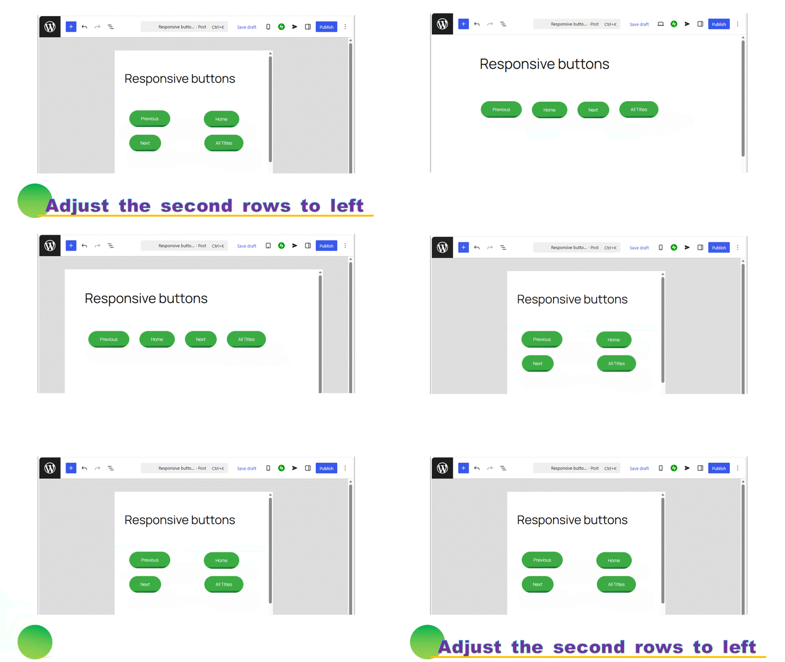
Grid block becomes resposive from WordPress 7.0, that enhances the expression of WordPress the more greatly. Here, let’s use the grid block to solve one of WordPress’s weaknesses: buttons are not aligned to the left. It becomes fully responsive.

How to use a Grid block

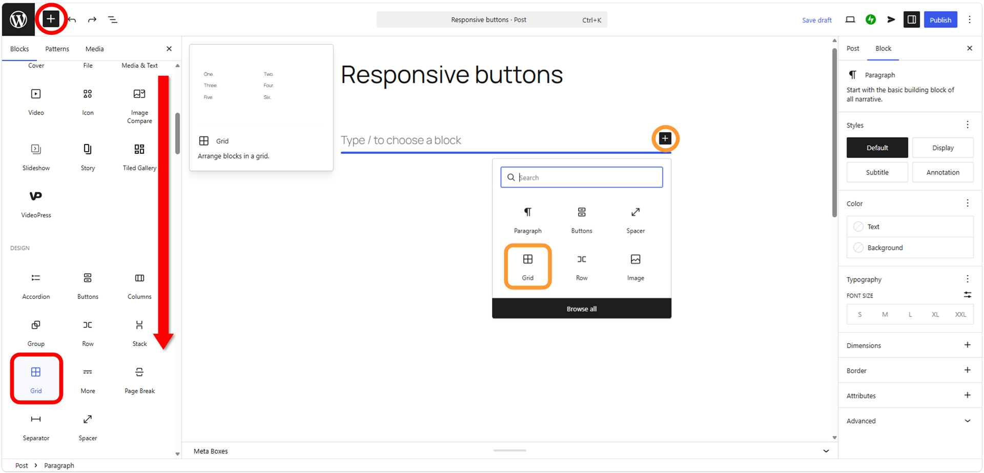
Set a Grid block.

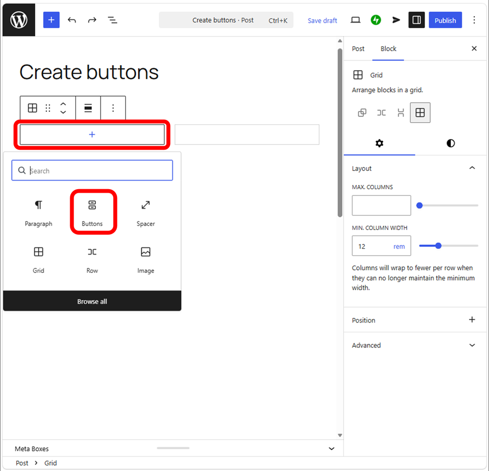
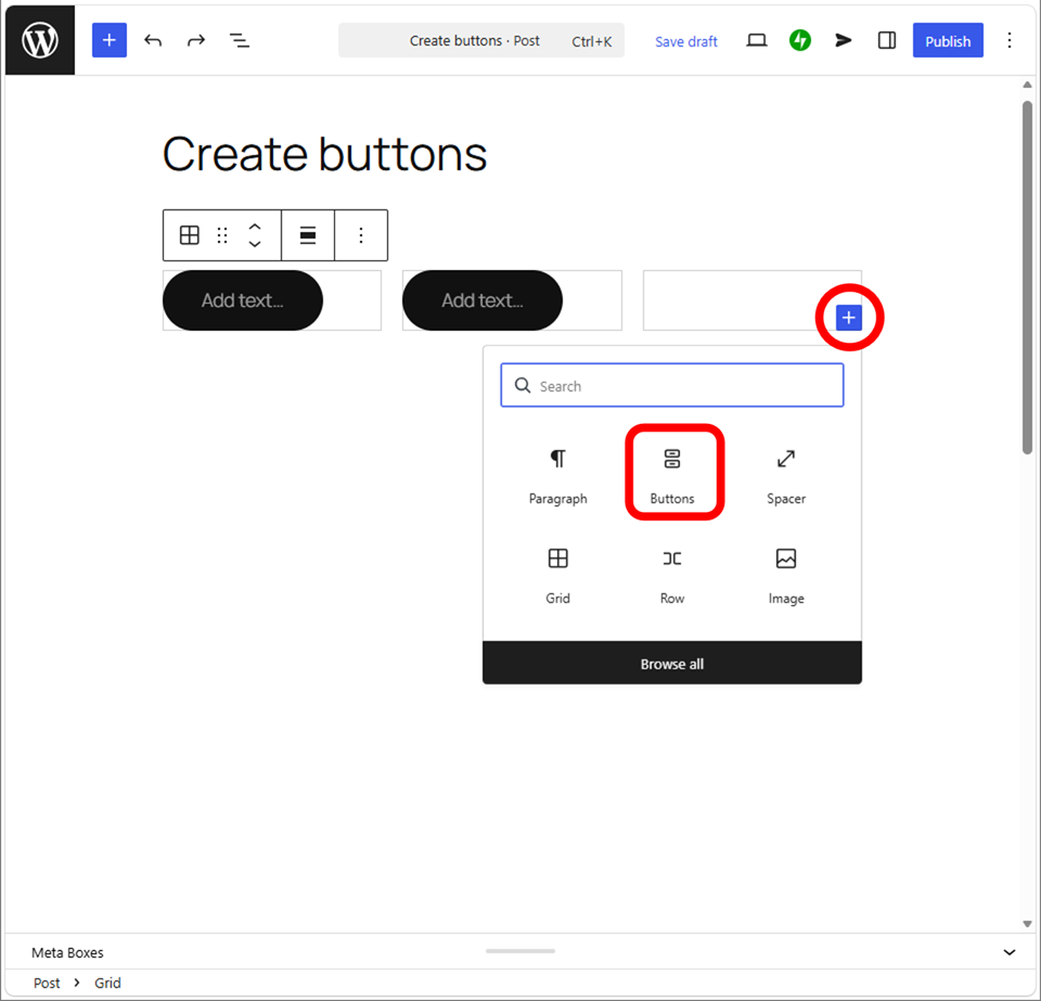
Next, press  to add buttons.

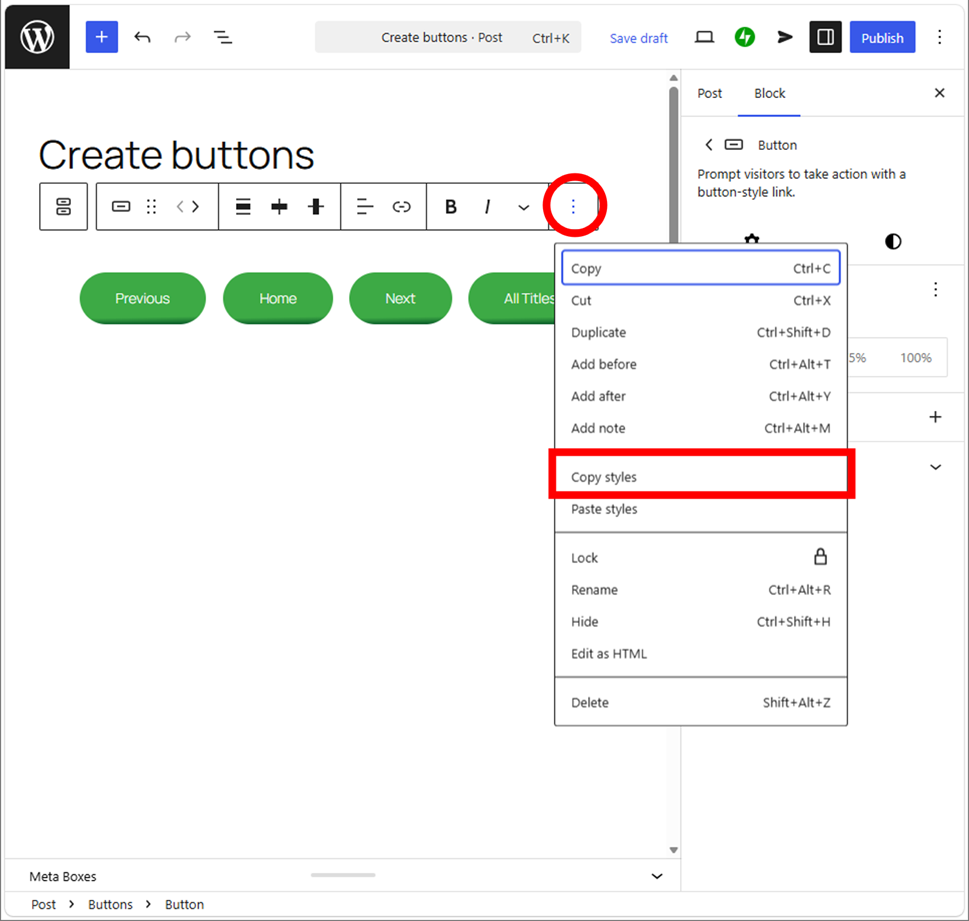
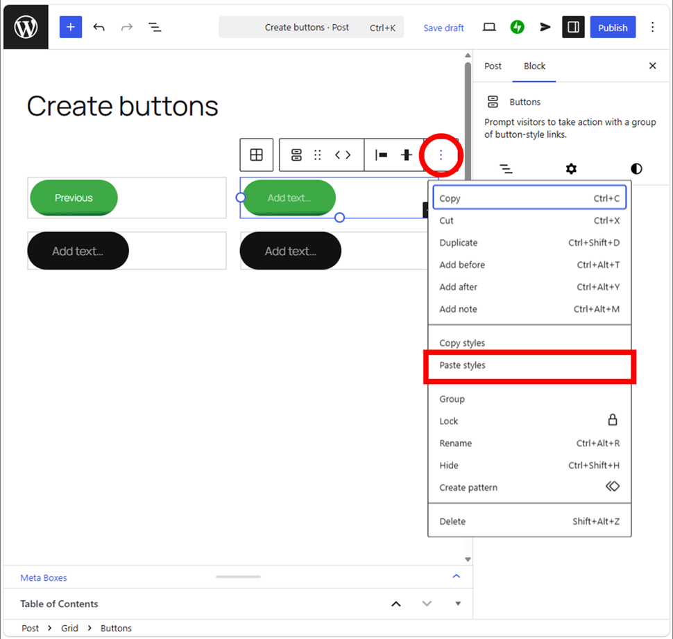
If you already have a button you’ve created, it’s good to copy the style.

This operation does not copy the button’s text, so you should type it yourself.

You can operate it from the tree view in the left sidebar.

If you create the buttons from scratch, please refer to below.

WordPress --- Create buttons
Creating a button is basic for Web creators. Master it.

Note that you never set all your buttons to a single Button block. Set each single button to a single Grid section one by one.

Points on creating Grid buttons

Not only set a single button block to a single Grid section, but also keep in mind that you never transform a button block to a Grid block directly. It means creating the multiple blocks within a single Grid section.

Even if hassle, create new sections as the number of buttons. You may have to set the button positions (left, center, right alignments, or space between items) one by one.

Aligning buttons to the left

You can adjust the position by using Row block, but as it changes all distance between the buttons, so it won’t be aligned when the width of buttons are different. In the hand, the Grid block aligns each section (block) to the left, so embedding one by one allows you to create left-aligned buttons.

You can create the less broken-layout buttons for both PC and mobiles.

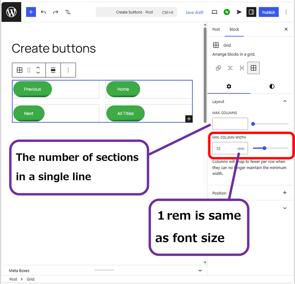
Adjust “Min. column width” according to the button width. Switch the screen to “Tablet” and “Mobile” then adjust to the optimal width.
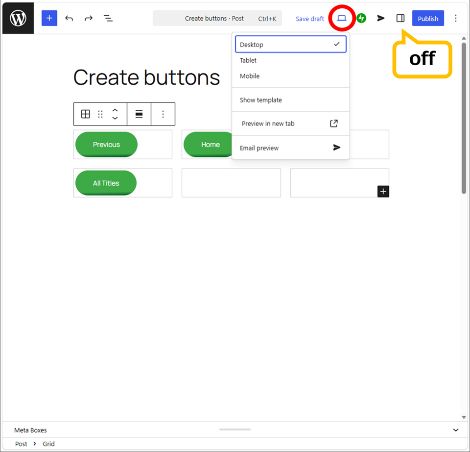
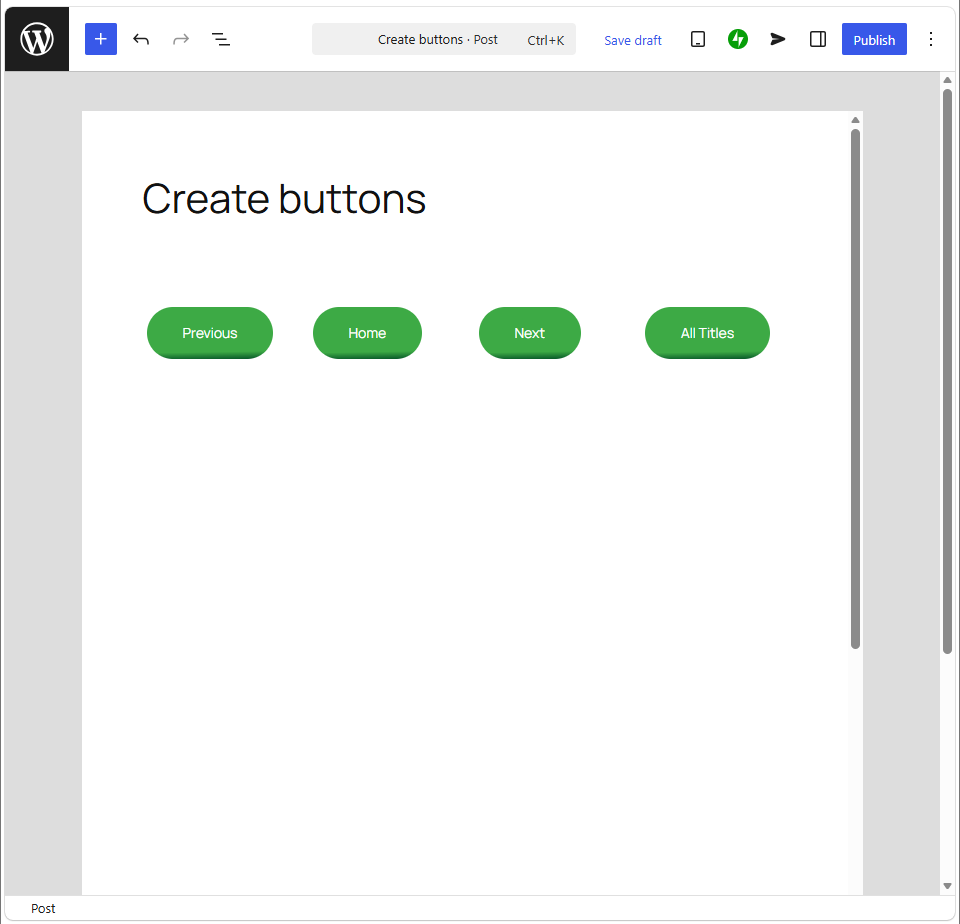
Desktop (rem12)
Tablet (rem9)
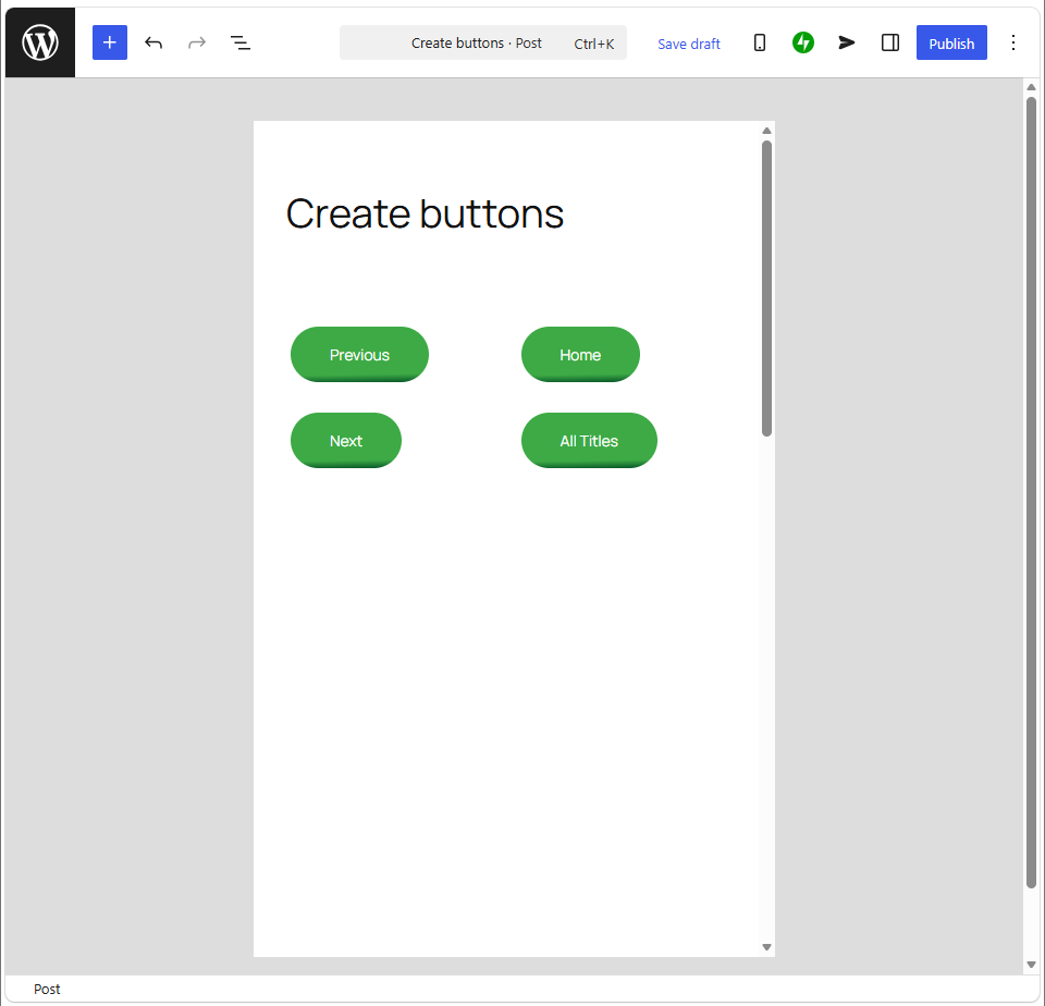
Mobile (rem9)

In this case, Desktop and Tablet are broken the layout by default (rem12).

Let you bring out the optimal value by yourself.

Examples of resposive buttons

You can check the buttons that look exactly below. Let you change the device to know the difference.

◎Left-aligned, rem12 (default)

◎Left-aligned, top-aligned, rem9, font size:M

◎Center-aligned, top-aligned, rem9, font size:M

The buttons aligned center also looks better. Keep in mind that the appearance is different from each theme. Twenty-Twenty-Five the genuine WordPress theme doesn’t have the need to change font size. If you will change font size to widen a button, here is it.

Thank you for reading.

Sponsored Links

If you feel this article “Like!”, click the ads below ⇩⇩
Your click makes my affiliate income. It motivates me (^^;.


If you give a tip ——

Reader's comments(読者の反応)

Copied title and URL