Income and Expenditure in Dec 2022
| carryover money | 13,519 yen▼ | details__ |
| internet charges (mon) | 1,100 yen▼ | 12,100 yen▼ |
| domain acquisition fee | 0 yen_ | 1 yen▼ |
| domain renewal fee (1yr) | 0 yen_ | 1,298 yen▼ |
| buy plugin | 0 yen_ | |
| buy software | 0 yen_ | |
| affiliate income | 0 yen_ | |
| surveyance costs | 0 yen_ | 1,220 yen▼ |
| total | 14,619 yen▼ | 14,619 yen▼ |
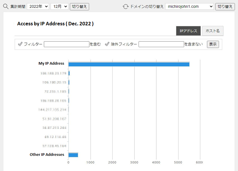
This month, I escaped from the cookie initialization trap, so I could increase the number of accesses.
No other is changed.
The deficit is increasing, too (^_^;.
There is still no progress on my homepage.
It is always the same, too (^^).
This month’s excuse is short, that was I made a mistake in my job. I am still unable to get out of this mistake. I don’t have much time to do other work by solving it.
Making table of Contents
Although I continues making my site a little, and now what I am challenging is that making ” table of contents ” for every page independently. One of WordPress’s disadvantages is that we cannot create a table of contents which jumps outside the page. If you want to make a table of contents in the sidebar, it will only display the titles and heading blocks in the current page.
It is like this.
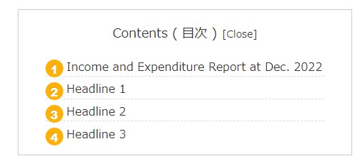
—— In order to create a table of contents which jumps outside the page, it is needed to make a special block and manually set the URL, but it cannot be set on the sidebar, which has different content from each page.
So I decided to make a table of contents that allows you to jump outside the page aggressively (^^).
Plugin Recipes


Using the function of Greenshift’s ‘ Sliding Panel ‘, create the button of ‘ table of contents ‘ with the function of ‘ Flex Box ‘, then type the word of contents, which can appreciate it. However, Greenshift does not have a way to stick the block, so I will install the ‘ Sticky Block for Gutenberg Editor ‘ plugin to stick it to the top of the page.
It’s like this.


From a smartphone, you can see both button rows by holding the screen horizontally.
Three-dimensional buttons are made with guts (^^;.
For too many buttons, smartphone displays them strange. So you create buttons for both of PC and tablet, then change the settings to one is for PC and another is for mobile, from ‘ Responsible and Custom CSS ‘ in Advanced settings.
It is like this.
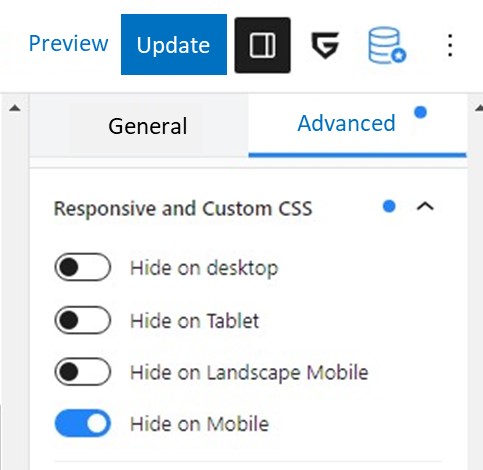
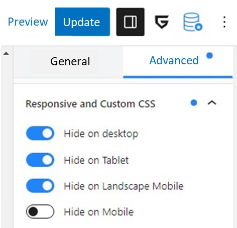
You should be careful if you select “Hide on desktop” on your PC, the blocks and buttons are suddenly disappeared from the screen, then you cannot edit them anymore. When you mess up, press the back button on the upper left. You can also change the display mode to ‘ Mobile ‘ in ‘ Preview ‘ on the upper right.

Anyway, it is better to set Responsible CSS at the end of editing.
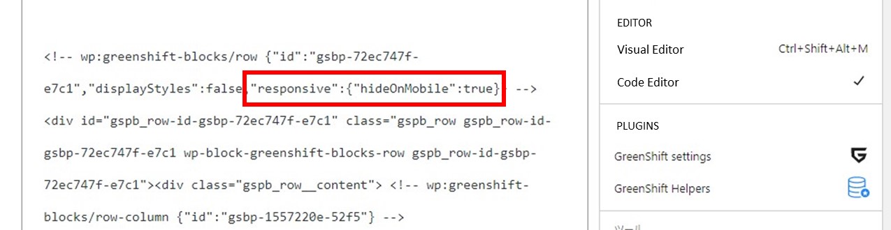
In addition, the Sticky Blocks plug-in does not have a responsive CCS function, I covered it with Greenshift’s Row block, for which the buttons are switched on the PC and the smartphone. Also, as Sticky Block has a transparent background, I set Cocoon’s ‘ Outlines Box ‘ between them, for which buttons and background are not mixed.
I removed this Outlines Box at the block for smartphones, for which reduce the block’s height. The lower buttons are only used when the stickies are overlapping. For example above, the buttons for smartphones can be used.
. . . While I made a block like this, it is ended up with a very complicated tree structure !
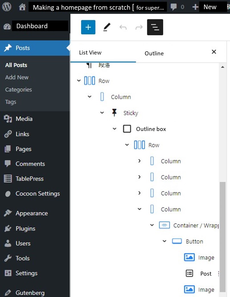
I want to skip this explanation at this time. It is very complicated (^^;.
It may be explained on another post someday.
I don’t know whether it is really for beginners (^_^;.
Good-bye ~~
Heading list of Cocoon
( extras )
Heading list on m-tomato skin in Cocoon theme
And, you can see which headings are displayed when you press ” Contents ” button of mobile. It is different Cocoon’s automatically made from block’s made ( In this example, the title of table is not displayed ).
Headline H1
Headline H2
Headline H3
Headline H4
Headline H5
Headline H6
If you feel this article “Like!”, click the ads below ⇩⇩
Your click makes my affiliate income. It motivates me (^^;.
If you give a tip ——
Leave a comment(コメントを残す)