
Income and Expenditure in February 2025
| carryover money | 48,844 yen▼ | details__ |
| internet charges (mon) | 1,100 yen▼ | 40,700 yen▼ |
| domain acquisition fee | 0 yen_ | 1 yen▼ |
| domain renewal fee (1yr) | 1,602 yen▼ | 5,800 yen▼ |
| buy plugin | 0 yen_ | |
| buy software | 0 yen_ | |
| affiliate income | 0 yen_ | |
| surveyance costs | 0 yen_ | 5,045 yen▼ |
| total | 51,546 yen▼ | 51,546 yen▼ |
Domain renewal fee is added this month.
It’s for three years since I created this site.
It’s not finished yet though (^^;.
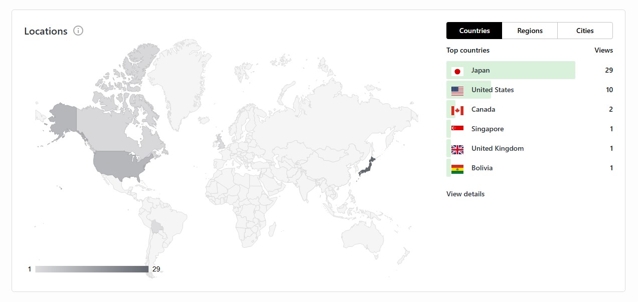
Welcome to my site, from Bolivia. I’m MichiroJohn.
It’s so exciting to meet other country’s people, with WordPress.
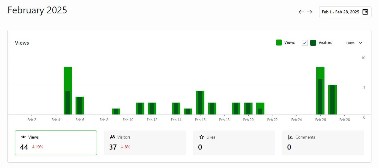
Viewer number becomes lesser by fewer days of this month.
To see the access dates, the number of accesses increases around when I posted or updated.
Consistency makes power. The continuation of posting increases the viewers.
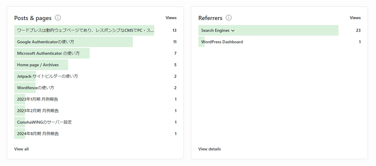
The Japanese version of ” How to use Microsoft Authenticator ” gets viewers firmly. It’s an app that is confused at the initial settings. I expect to get many viewers as same as ” How to use Google Authenticator “.
The Japanese version of ” How to use Wordfence ” gets viewers already. It’s a plugin that has a bit trouble to use, so I expect it to get viewers more.
The Deteriorations in the world 5 — Excel’s (the final)
I’ll stop dissing Excel here, because I’m tired a bit (^^;.
At the final session, I would like to try my best to create a 2D graph using Excel.
But I’ll still continue dissing it.
The color codination is poor.
I think Excel is an excellent software, but it suffers a loss with coloring.
I think that is why we can’t meet Excel graphs so much on the net.
Around Office 2010, the colorings becames a bit uncool, but it becomes better recently, although I still think it bad. It looks dirty when it is printed even if it is created as colorful, so I guess it’s one way to make them dirty from the start, but it also looks bad when uploaded the graph to the net. There needs to learn about colors properly.
Excel as a 2D graph creator
I will create graphs with all my best, as a second-grade Information Processing Engineer (Excel engineer) !
By the way, it’s not a great qualification on the second-grade (^^;.
I’ve done. . .
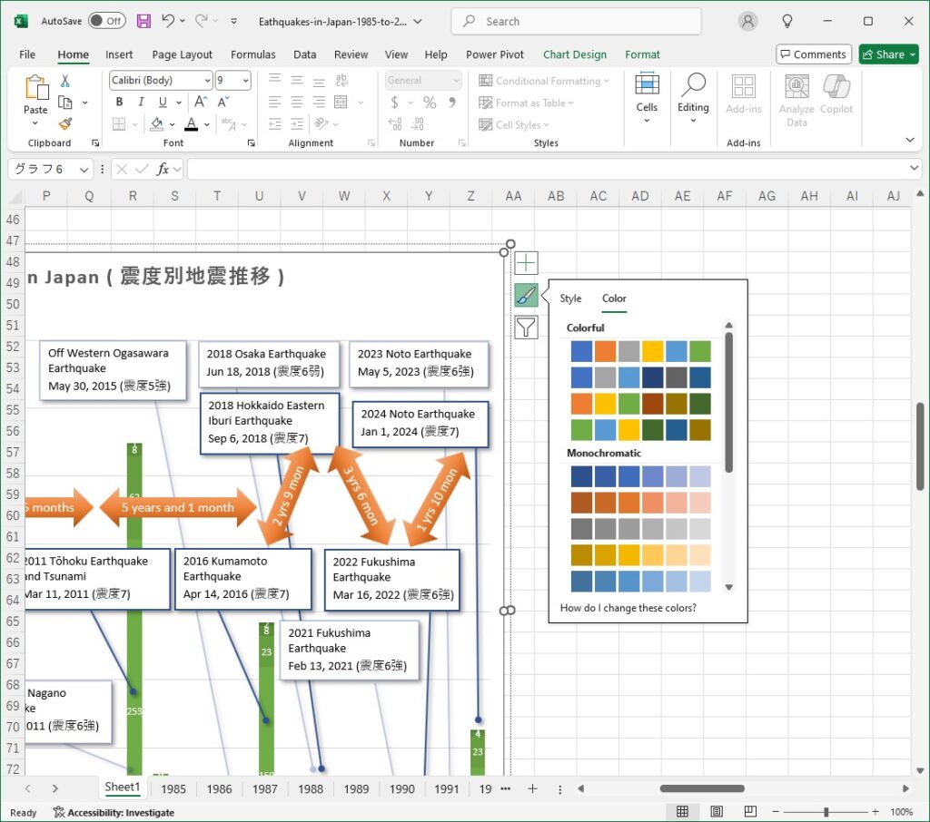
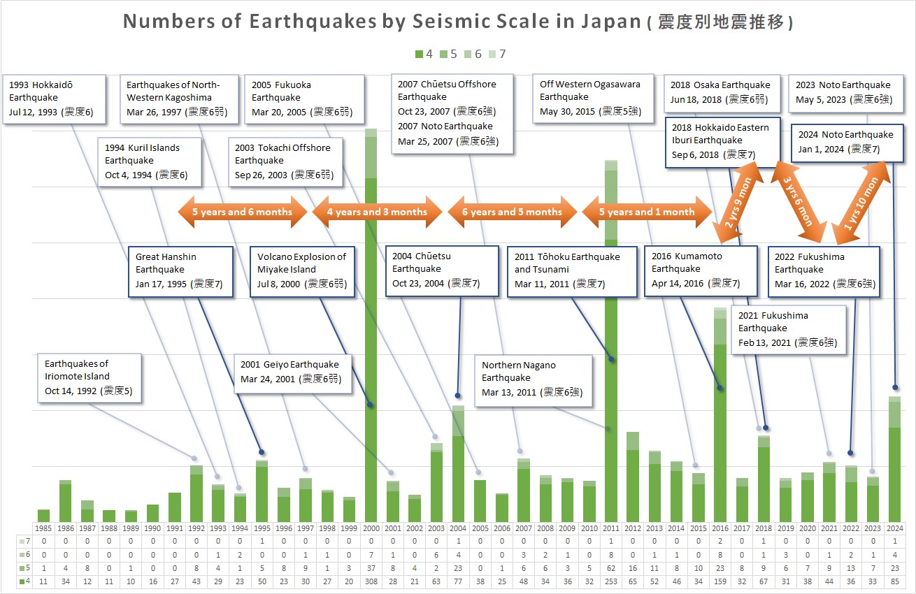
This is a stacked bar graph of earthquake data from 1985 to 2024 for 40 years. Seismic intensity is the earthquake level we can experienced physically ( not equaled with Magnitude ). The Data of level 3 or less has been omitted. The graph shows that the number of earthquakes is gradually increasing. In the past, earthquakes and volcanic eruptions occurred every 5 years roughly, but now, severe earthquakes have occurred as like annual events.
Is it by global warming ?
Anyway, I made all the earthquake spans and the information boxes manually. We manually have to make such kind of things with any other graph creators, but if AI could create it, that’s nice. It’s good to display a pop-up information when clicking the bar. That can be found on the net, is it. I’m expecting such new feature.
Excel as a stat software
Excel is also an excellent stat software, so I will explore the relationship between global warming and earthquakes using graphs.
By the way, I slept well at statistics lectures (^^;.

Hmm?! This upward trend is clearly evident.
It requires the approximation lines to make a comparison.
Now, let’s googling ! (^^;
—— To see it, take the average of data, calculate the standard deviation, the variance is unsound, then draw a scatter plot with the standard deviation as the axis…, the normal distribution, 2δ, 3δ, ……
The explanations on the net were incomprehensible as like a statistics lecture (^^;.
But I realized that there is a way to draw the approximation lines in Excel.
It is that.
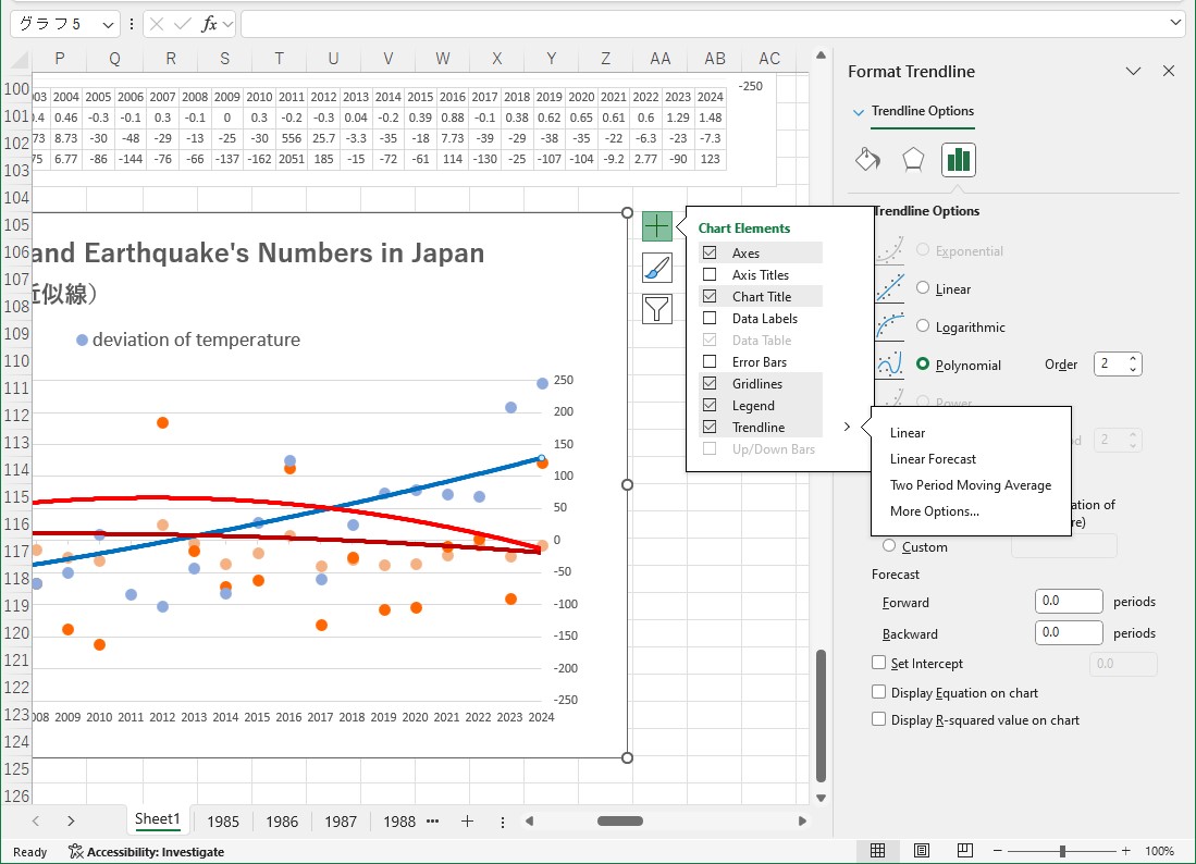
Oh, the average and standard deviation are no need.
Then I drew it.
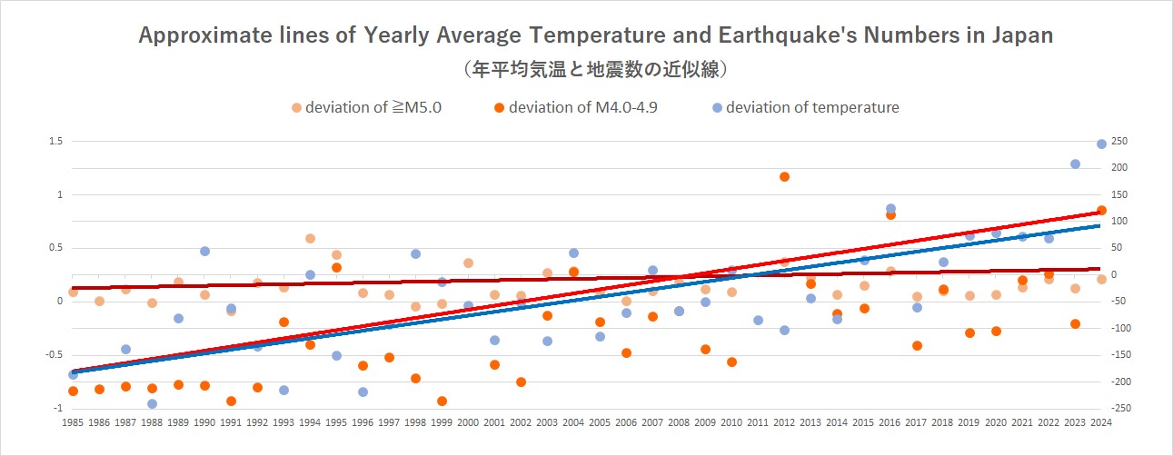
I tried to draw curve approximations, but the result was straight lines. There was a slight problem with the scale settings, that are the yearly average temperature is within a range of -10 to 15 deviations from the average value of 16.7°C (62.06℉) from 1991 to 2020, but the number of earthquakes is within a range of -250 to 250 deviations. Align the scale values, the blue line (yearly average temperature) will get quite close to the brown line (earthquakes of ≧ M5.0). It might be correct in itself, but it’s different from the graph two above.
To evaluate them, maybe needs that ——
Significant difference
t-test
(-_-)zzZZ
I will do it another time (^_^;.
By the way, there is my guess; the Earth’s crust is never influenced by increasing tmperature, so the global warming never add any effects on the number of earthquakes. However, seeing the number of earthquakes by magnitude, it is often seen the increase of earthquakes in the same year or the next year after the temperature rises. This means that the opposite phenomenon would be occurred —— the frictional heat in the Earth’s crust increase the temperature. However, in this caase, the increase of temperature would be occurred after the increase of earthquakes occurred, but such one has not been seen. The temperature is often decreased after sever earthquakes occurred.
It seems very difficult to prove it (^^;.

End
[Thanks Japan Meteorological Agency for giving the data]
If you feel this article “Like!”, click the ads below ⇩⇩
Your click makes my affiliate income. It motivates me (^^;.
If you give a tip ——
Reader's comments(読者の反応)